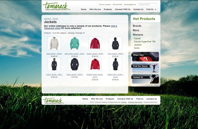
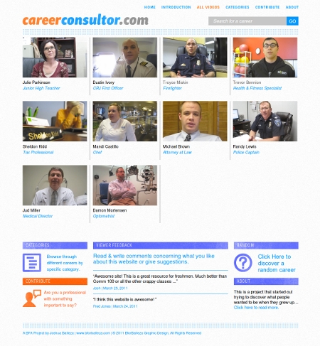
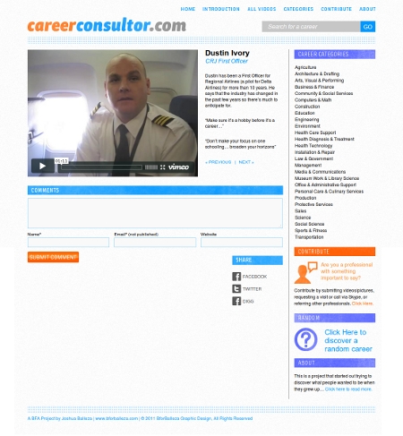
Homepage, like the rest of the site, focuses on the products being sold.
The Caffeine Cam website is focused on selling Canadian candy and snacks to the states. It required a custom shipping calculation module, supporting fedex and USPS.
A fun little bit that I discovered during the creation of this website is that you can give your links an underline with a color different than the font color itself (see primary navigation in the header), by giving the <a> tag a border-bottom instead of a text-decoration: underline;. The idea actually came from the implementation of the theme on this website, which uses the same technique.
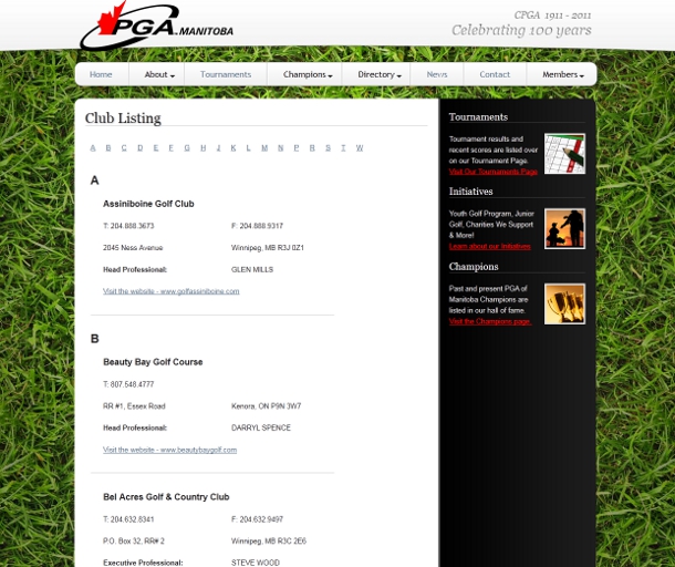
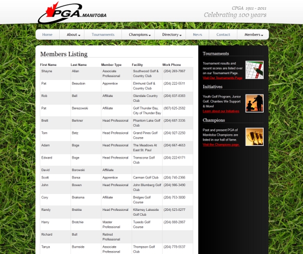
The two highlights of this project for me were the several tricks for cutting out the images from a PSD file I learned, and the 2 user interfaces I created for the Member directory listing and the club directory listing.
The HTML & CSS were fun to create because I learned a few new tricks for cutting out the images out of the PSD file:
If you select a wider area around an image, if there is nothing else other than that image in the selection Photoshop only selects the image. This helps with not having to exactly select the pixels you need, which makes things slightly faster
If you copy a layer over to a new file, if the effects applied to the layer are not copied over, you can right click on the original layer and select “copy layer style” then paste it over into the layer in the new file.
To select a layer exactly, you can first select the selection tool, then hold down ctrl and click on the image representing the layer in the layer browser on the right. Then you can easily cut it out to get the image to use in the CSS.
The Club directory listing is alphabetically ordered, and there are two methods used that make it easier to find what you are looking for:
On the top of the list, there is a “table of contents” – a list of links to the first letter of the club name.
Along the left side of the page, the first letter of the club name is shown in large letters above the first club with any given initial.
The Member directory listing uses a tabular layout, and the rows are alternating in color for making it easy to read a single row. The columns are separated with a border which makes it easy to read down a single column.
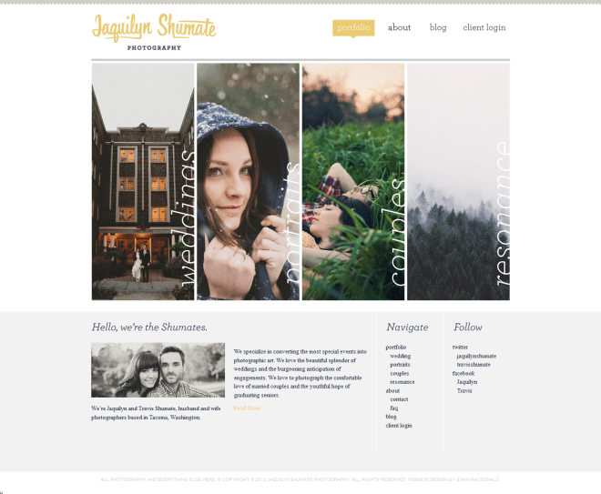
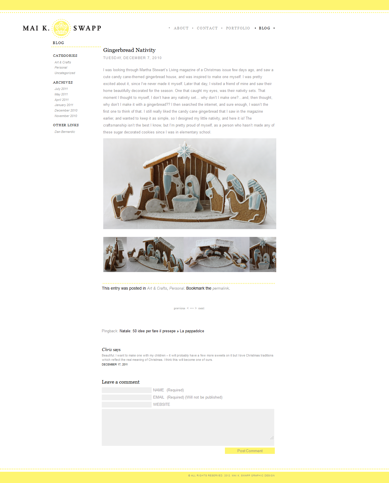
The home page is an about me page with different sections triggered by hovering over the imagesThe website features a portfolio section with a collage of the various portfolio images on the front pageThe blog features beautiful images taken by Mai herself
Mai designed a personal site with a portfolio and blog section for herself. It was one of my first WordPress-based website builds.
One thing I got my first try against in this project is how to make that footer on the short home page stay on the bottom of the browser window.